Alexander von Ness - November 9, 2023 - 
Book Cover Redesign Study Case – “How a Monster is Made”
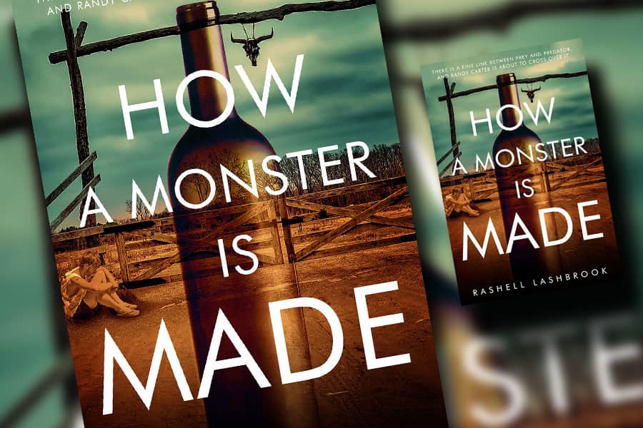
In a book cover redesign “How a Monster is Made” case study, I will show you in a few simplified steps how I made a beautiful cover redesign with just a few simple images.
Why book cover redesign?
When I make a book cover redesign, I have two basic questions in mind.
Why does the author want to redesign his cover, and what message does he want to send to his readers?
In theory, the book cover redesign should not be much different compared to the classic book cover design. The problem is that I am usually limited by the previous design.
The authors generally do not want to change the design concept, but “only” improve it to make it more beautiful, attractive, and professional.
That “only” sometimes gives me enormous headaches.
After reading the brief content of the book, and analyzing the facts and events found in the book, the most important thing for me, as a book cover designer, is to create a cover design that will convey the message the writer wants to express to his readers.
In addition to the fact that the cover design must be attractive and eye-catching, the design must also be adapted to the target audience.
The most important thing is to understand right from the beginning what the message of the book is and for whom it was written!
Every time an author asks me to create a book cover design, I send my book cover design questionnaire, which contains 15 carefully selected questions that the author must answer.
The answers to my questions help me eliminate many doubts right at the beginning and relieve me of redundant and unnecessary information that distracts my attention from what is important.
Although I do a cover design for each of my clients as if they were the president of the US, I am especially glad that Rashell emphasized in her answers to my questionnaire – “You came highly recommended through Jane Friedman”.
So, let’s start with design brief:
“How a Monster is Made” is set in post-WWII Texas, so there could be a historical element to the cover, or at the least nothing dating to current times. This book is about the childhood of a man who will go on to commit unimaginable crimes against the most vulnerable in society.
Curious and energetic, Randy Carter is an ordinary enough little boy in the beginning. Born post-WWII in a sleepy Texas town, he is the middle child of an alcoholic father and a mother who suffers from bouts of severe psychosis. Forced to survive in an unpredictable world of violence and poverty, Randy develops into a calculating young man with a growing need for control.
This is what the previous cover and additional design concept of the first designer looked like: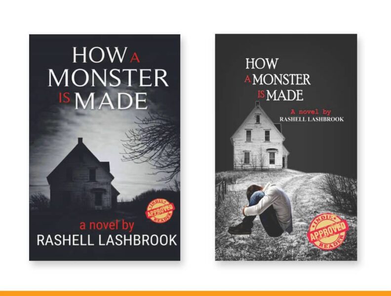
I spent some time on Pixabay looking for an adequate images that would immediately let the reader know which location the book is about.
This image caught my eye and I quickly saw potential in it for the background of the cover. I focused on a part of the image that I immediately saw as the ideal background priority.
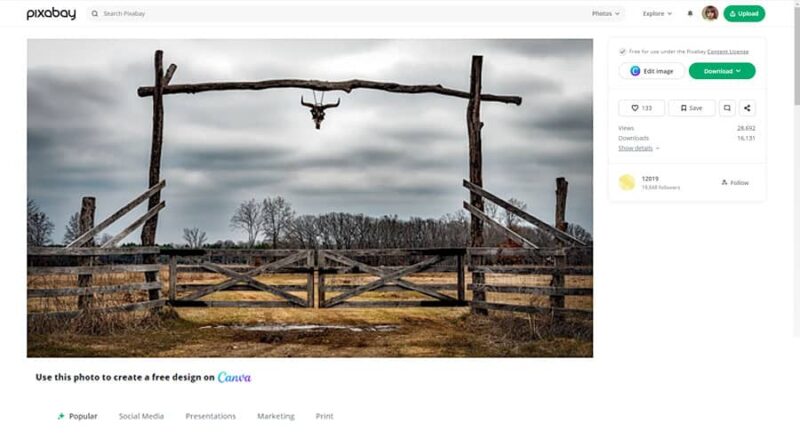 Although I found several other excellent images, I still decided on this one and started creating this cover design with it.
After “playing” with the image a bit, I focused on only one part of the image that was the most striking and which I thought was the most interesting.
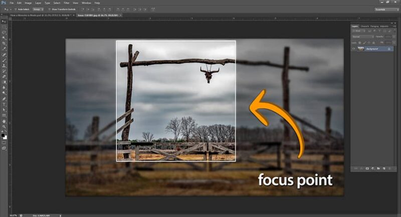
I never start working on a cover until I have an idea in my head!
Given that the lower part of the cover remained blank, I inserted the dusty road from the second image and combined the two images into one compact background. Above the top image, I added a little more sky to create extra space for the subtitle.
The drawn line shows the place where the two images overlap, which I made almost imperceptible with a little additional adjustment and refinement.
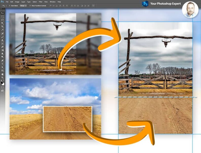 Although this looks quite simple in the picture, sometimes you need to set aside quite a lot of time for something like this. Of course, I, who do this every day, need much less time than someone who does not deal with this professionally.
However, as a professional, I know to spend a lot of time on such seemingly simple things.
Since this book is about alcoholism and the violence caused by it, I had to show it in some way.
However, given Amazon’s very strict restrictions on advertising alcoholic beverages and everything related to that, I had to figure out a way to do it without risking Amazon rejecting the cover design while at the same time conveying the main message of the book.
By making the bottle transparent and “gluing” it to the background, I was able to avoid the appearance of emphasizing the bottle as an object. I was confident this would no longer be a problem to Amazon.
I had successfully “merged” it into the background.
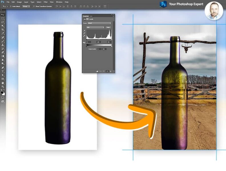
At this moment I knew that this would be a great cover design!
The author wanted me to insert the image of a lonely and depressed adolescent who is one of the characters in her book. She wanted to portray him as a victim of alcoholism.
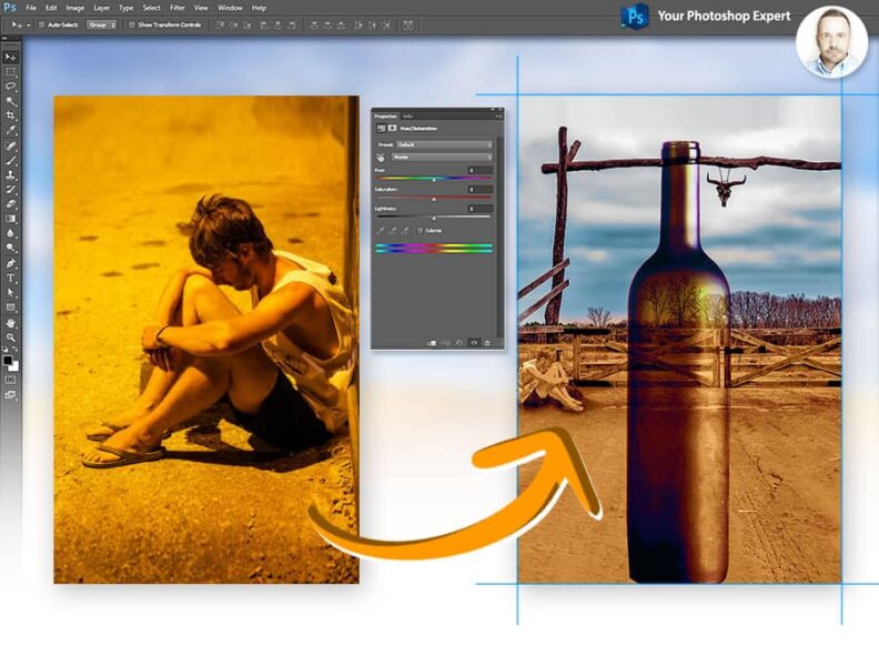 After that, I tried different tonalities and color vibrations to make sure I got the best out of the design.
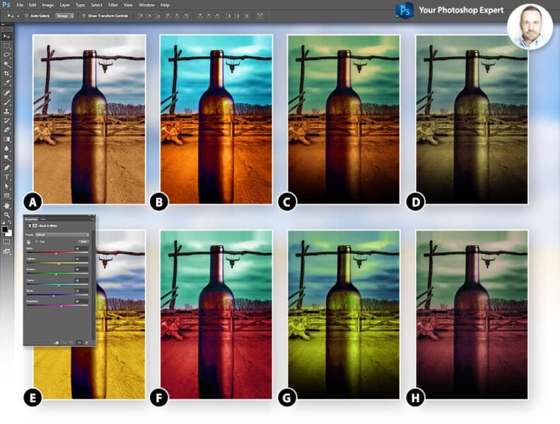
I hesitated between versions B, C and F, but after several comparisons I decided on version C.
And finally, the most important thing in book cover design. Typography!
The choice of font is one of the most important things when we talk about book cover design.
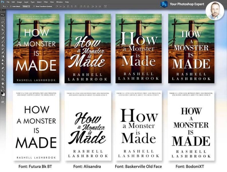
As I always do, I made several different versions of the cover design with different font titles and sent it to the author to see which one she liked best. Together, we decided on a title with the Futura Bk BT font, which is perfectly visible at thumbnail size and which I personally like a lot.
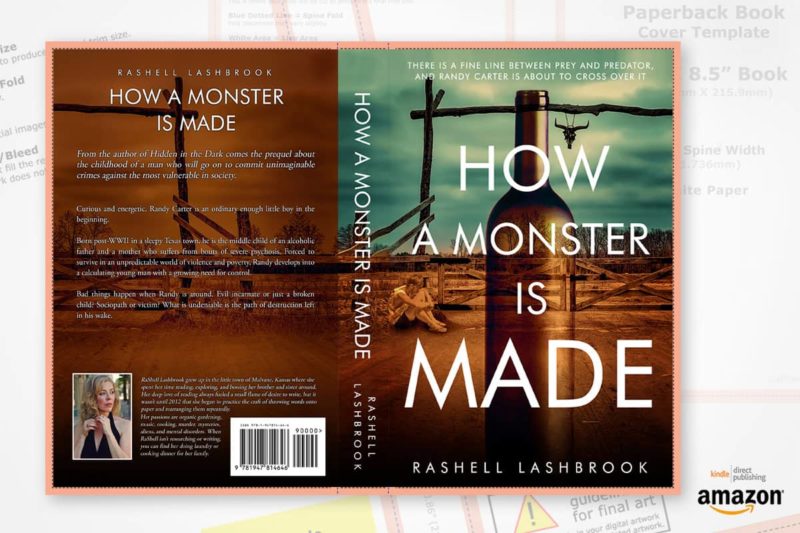
After that, I made a background and the book spine to look like one unity.
In the end, I create print-ready PDF files (kindle and paperback) and store them in my Book Cover Download Dashboard from where the author can download all his print-ready files (24/7) and immediately upload to Amazon.
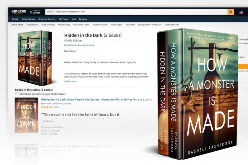
Given that Rashell was thrilled with the cover redesign I made for this book, she immediately ordered a cover redesign for her other book (even though she hadn’t planned to redesign it at all!), so I made a cover redesign for that book as well.
Now both books seem connected, which gives the author brand recognition.
You can view and buy the books at Amazon.
In my Portfolio on the page Cover Redesign, you can see the presentation of this cover redesign, and how the cover looked before and after the redesign.
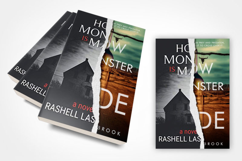
As you can see for yourself, many things are much simpler than they seem at first. The results can be far better than you expect.
As Rashell said, “This cover redesign is the real deal! The book gained visibility overnight! The book sales increased several times! Everything I was hoping for came true!”
What can I say, is there anything to add to this?
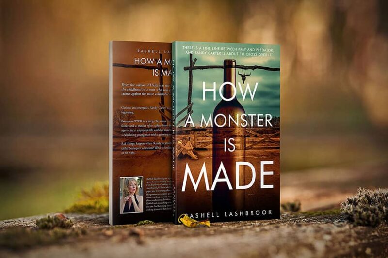
Very often, bad cover design leads to bad book sales! A simple redesign of a book cover often creates miracles marketing-wise!
Would you like a cover redesign for your book?
Just send me a message and enjoy the process.
If you liked this article you might also like:
• Amazon Author Central – How to Setup Your Author Page on Amazon!
• The Book Marketplace Has Changed. Make Your Book Available From All the Online Retailers!
• The Levels of Writing and Editing Explained Once and for All
• Why First-Time Authors Need an Editor!
• Book Marketers Secrets – 7 Secrets of Top Book Marketers!
• Self-Publishing Success Stories. Secrets of Million Dollar Self-Publishers!
• Never Judge a Book By Its Cover! – Are You Really Sure?
• Business Plan for Authors. Do Authors Need a Business Plan?
• Creative Book Marketing Ideas for Selling Your Books!


