
Alexander von Ness - October 13, 2021
Book Cover Design Awards – October 2021
Welcome to the Book Cover Design Awards organized by The Self-Publishing and Book Marketing Blog.
Last month we received 18 covers.
Judge: Alexander von Ness
Alexander is a book cover designer with almost thirty years of professional experience in graphic design, including over a decade as an art director in a branding agency. His website is among the top trusted sites for book cover design services overall and this Self-Publishing and Book Marketing Blog has been selected as one of the 100 Best Websites for Writers.

The winner of this month’s
Book Cover Design Awards is
Kitten from Deranged Doctor Design

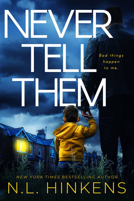
Designer: Kitten from Deranged Doctor Design
Book Title: Never Tell Them
Submitted by: Darja Deranged Doctor
Book description: When mysterious, single dad Ray Jenkins moves in to the neighborhood, Sonia is suspicious from the outset that something is amiss.
Alexander von Ness: Great cover design. Outstanding tonality and very intelligent composition. The yellow color that emphasizes the related elements (child and room) as a contrast to the dark blue is performed fantastically. This is a classic example of what a cover design should look like that is primarily focused on the target audience. Cover design that awakens the imagination and attracts attention.
-

Designer: Bob Aulicino
Book Title: Fifteen
Submitted by: Carolyn DoyleBook description: The book is a novel about a mother and her 15 year old daughter in the Bronx 1967.
Alexander von Ness: Unbalanced cover. The background image is unnecessarily obscured (hidden). The colorful "fractal" is too large and represents absolutely nothing to the reader. Basically, a cover design that says nothing about the book nor is it intended for a target audience. I suggest a complete redesign of the cover. I apologize if I'm a little rude but I'm writing all this with the best of intentions.
-

Designer: Nancy from Deranged Doctor Design
Book Title: Crossed By Death
Submitted by: Darja Deranged DoctorBook description: Book cover design for Crossed By Death, by ACF Bookens. Cozy Mystery cover design by Nancy, Deranged Doctor Design.
Alexander von Ness: This cover design looks to me like it’s made of two unrelated covers. I guess it was the client’s wish and the designer unfortunately relented under the client’s pressure. The upper part of the cover is great but the lower part spoiled the whole composition of the cover. Instead of everything looking as a single entity, the top and bottom of the design seem to collide with each other. The choice of colors is good.
-
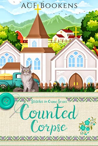
Designer: Nancy from Deranged Doctor Design
Book Title: Counted Corpse
Submitted by: Darja Deranged DoctorBook description: Book cover design for Counted Corpse, by ACF Bookens. Cozy Mystery cover design by Nancy, Deranged Doctor Design.
Alexander von Ness: This cover design looks to me like it’s made of two unrelated covers. I guess it was the client’s wish and the designer unfortunately relented under the client’s pressure. The upper part of the cover is great but the lower part spoiled the whole composition of the cover. Instead of everything looking as a single entity, the top and bottom of the design seem to collide with each other. The choice of colors is good.
-

Designer: Nancy from Deranged Doctor Design
Book Title: Stitch X For Murder
Submitted by: Darja Deranged DoctorBook description: Book cover design for Stitch X For Murder, by ACF Bookens. Cozy Mystery cover design by Nancy, Deranged Doctor Design.
Alexander von Ness: This cover design looks to me like it’s made of two unrelated covers. I guess it was the client’s wish and the designer unfortunately relented under the client’s pressure. The upper part of the cover is great but the lower part spoiled the whole composition of the cover. Instead of everything looking as a single entity, the top and bottom of the design seem to collide with each other. The choice of colors is good.
-

Designer: Milo from Deranged Doctor Design
Book Title: The Bear
Submitted by: Darja Deranged DoctorBook description: Book cover design for The Bear, by Jamie Lee Grey. Post-Apocalyptic cover design by Milo, Deranged Doctor Design.
Alexander von Ness: Great cover design! If this competition had two winners, this cover design would be the second winner. Everything is done properly. Composition, typography, color tonality, everything is done very professionally. I would love to see the next book when it is designed ;)
Gold-starred cover design. -
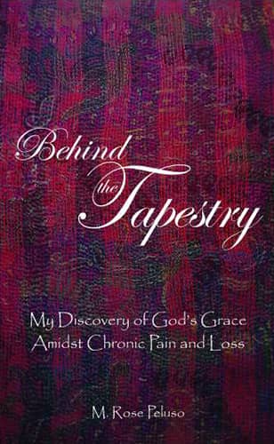
Designer: Christine Fontanazza of Hire Art Services
Book Title: Behind the Tapestry: My Discovery of God's Grace Amidst Chronic Pain and Loss
Submitted by: Maryanne PelusoBook description: I wanted the book's cover to reflect a tapestry. But not just a tapestry – the BACK of a tapestry. An old college friend of mine photographed the back of a scarf and then superimposed the title, subtitle and my name on the image.
Alexander von Ness: Unfortunately I have to say this is one repulsive design. I hope the author won't mind me but this design doesn't make any sense. Bad choice of typography not to mention Papyrus font which is one of the most undesirable fonts in general. I ask the author not to resent me but this cover design must be replaced.
-

Designer: Hannah Lindsey
Book Title: Waiting For Daddy To Come Home
Submitted by: Desiree HuskeyBook description: The cover features Oreo a fluffy, tuxedo cat. “Waiting For Daddy To Come Home” shows how much our animals can feel lonely and sad when their owners are away. The book also shares the joy of when Oreo’s “Daddy” returns.
Alexander von Ness: A beautiful illustration. My advice is to reduce the image a bit and emphasize the title (I would bold it). Too many fonts for so little text.
-

Designer: Alex Williams
Book Title: The Complexities of Love
Submitted by: Melisa QuigleyBook description: Mark feels like he is a Guianan cock-of-the-rock, a gay bird albeit stuck in the confines of a cage. Pigeon-holed because of society’s beliefs about who I am meant to be, how I’m meant to live my life, and who I should marry.
Alexander von Ness: Promising idea with a decent illustration, however the person who did the typography completely destroyed the whole cover design. Four types of font on the cover is unacceptable and one of the biggest mistakes of any designer. The cover has no balance and the promising cover design is ruined with poor choice and positioning of letters.
-

Designer: Nicole Prangley
Book Title: TouchingHabits
Submitted by: Richard EdwardsBook description: What happens when physical distancing becomes the norm for society? When it is possible to download your consciousness into an android, when artificial intelligence gets bored, when babies are conceived and born in smart incubators, when the USA no longer exists?
Alexander von Ness: I have to admit that the description of this book is irresistible. Unfortunately, on this cover design everything is done wrong! The colors of the book’s title and the author’s name are a completely bad choice. The author's name can hardly be read. The progressive shadow in the characters is not only superfluous but is even made in the wrong directions. Sorry, but I suggest you completely redesignate the cover.
-

Designer: Colleen McCubbin
Book Title: Treasures Gained in This Land
Submitted by: Colleen McCubbinBook description: For the cover image, I purchased an extended license through Adobe Stock. A friend detected a weird line under the mountain, so he edited the file and added the reflection. The author was thrilled with the colours and the iconic pictures. I wrapped the landscape around the back and lowered the flying birds to accommodate the text.
Alexander von Ness: I would throw out a “reflection” that looks like a stain, change all the text to white, enlarge the title, and lower it a bit. I would move the birds to the lower left corner, subtitle at the top left and put the author’s name at the bottom right to balance the design.
-

Designer: Ivan Semonchuk
Book Title: Journey to a Strong Tower
Submitted by: Marcia LaycockBook description: This is a YA fantasy novel.
Alexander von Ness: Very simple design. There is not much to say about this design. Good typography. Simply, a design that fulfilled its purpose.
-

Designer: Oliver Kryzz Bundoc
Book Title: Becoming Santa: Mom today at the Christmas Party Tommy said Santa isn't real!
Submitted by: Cyndi "Go Go" MerrittBook description: Daniel discovers the true meaning of Becoming Santa through the words of the author, Cyndi Go Go Merritt, and the illustrations of Oliver Kryzz Bundoc.
Alexander von Ness: Very nice and attractive illustration. It's a shame that the excellent illustration is spoiled with the wrong typography. Picture books should be made with extreme care because they are written for children. And you can't lie to children! This typography is more like a newspaper article than a picture book for children. Change the typography and you will have a top cover design for your picture book ;)
-
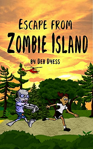
Designer: Debora Dyess
Book Title: Escape from Zombie Island
Submitted by: Debora DyessBook description: This is a children's chapter book, so the cover design targets that age group. Because I am an author, I don't have an official 'design site'. I'm just really getting started in taking this business seriously, so forgive the Amazon Author page as that link. :) Thank you for this contest! I'm excited to receive a review.
Alexander von Ness: Honestly, these characters are a little too morbid for kids. If you were targeting older children (12-16 years old) then the characters are too funny, so they are not suitable in any case. Given your honesty and enthusiasm, I am willing to help you and refine this cover completely free of charge.
-

Designer: Ana Grigoriu-Voicu
Book Title: Hidden Scars (Scars of Days Forgotten Series)
Submitted by: Ana Grigoriu-VoicuBook description: The urban fantasy adventure "Hidden Scars" is the second book in the Scars of Days Forgotten series by Natalie J. Reddy.
Alexander von Ness: Excellent and professional cover design. Completely hit design for target audience. I really like the composition and the tonality of the colors. I think the animals (white tiger and wolf) are a little too dark for my taste and should be slightly enlarged. All in all a great job!
Gold-starred cover design. -

Designer: George B. Stevens
Book Title: Product Sense: How to Solve Problems Like a PM, Ace Your Interviews, and Get Your Next Job in Product Management
Submitted by: Braxton BraggBook description: "Product Sense" is the go-to resource for those aspiring to become product managers at technology companies. We demystify the inner workings of the application process, help candidates think about products in the technology space and how to make them better, and ultimately help them launch a career in product management in a technology company.
Alexander von Ness: Great design. I really have nothing more to say here. Everything is fine and I would not change anything.
Gold-starred cover design. -

Designer: Cheri Fields
Book Title: The End: A Bible Prophecy Study for Teens
Submitted by: Cheri FieldsBook description: If I had 6 lifetimes I'd spend one of them being a book cover designer–I love them so! Therefore, I decided to see what I could do with GIMP. This is the result. The original graphic is a public domain image and the fonts are 18thCentury and Narrenshiff Light.
Alexander von Ness: Only after reading the subtitle I realized what kind of book this is about. With this cover design it is almost impossible to attract the attention of teenagers! A new cover is definitely needed for this book.
-

Designer: Marla Anderson
Book Title: Unethical
Submitted by: Marla AndersonBook description: The author designed the cover.
Alexander von Ness: Although this is a thriller, I think it is "too dark" in terms of design. I get the impression that the title, the author’s name and the subtitle “dance” each to its own side. "Stretching" and lengthening the font is completely unacceptable according to the strict rules of cover design. The picture is definitely interesting and intriguing and I think it should be brightened and highlighted to make it more noticeable (especially at thumbnail size).
We hope you learn something new about what works and what doesn’t work in this book cover design awards contest, and that it will help you correct any omissions and improve your book cover. Remember, a good book cover design is the best marketing tool you have to sell your book, and don’t get it wrong right from the start.
The deadline for the next submissions will be 31st October 2021.
Click here to submit your e-book cover.
Join the Self-Publishing and Book Marketing Group.
The original announcement post.
Award winners and Gold-Starred covers win the right to display our badges on their websites.
If any of you are interested in redesigning your cover, visit the Book Cover Redesign page to see examples of the successful redesign. All of you who have entered this contest have an additional $50 discount on the redesign of your cover.
Past Book Cover Design Awards
Book Cover Design Awards, September 2021
Book Cover Design Awards, Cover Design, Self-Publishing,

