Alexander von Ness - November 19, 2021
Book Cover Design Awards – November 2021
Welcome to the Book Cover Design Awards organized by The Self-Publishing and Book Marketing Blog.
Last month we received 17 covers.
Judge: Alexander von Ness
Alexander is a book cover designer with almost thirty years of professional experience in graphic design, including over a decade as an art director in a branding agency. His website is among the top trusted sites for book cover design services overall and this Self-Publishing and Book Marketing Blog has been selected as one of the 100 Best Websites for Writers.

The winner of this month’s
Book Cover Design Awards is
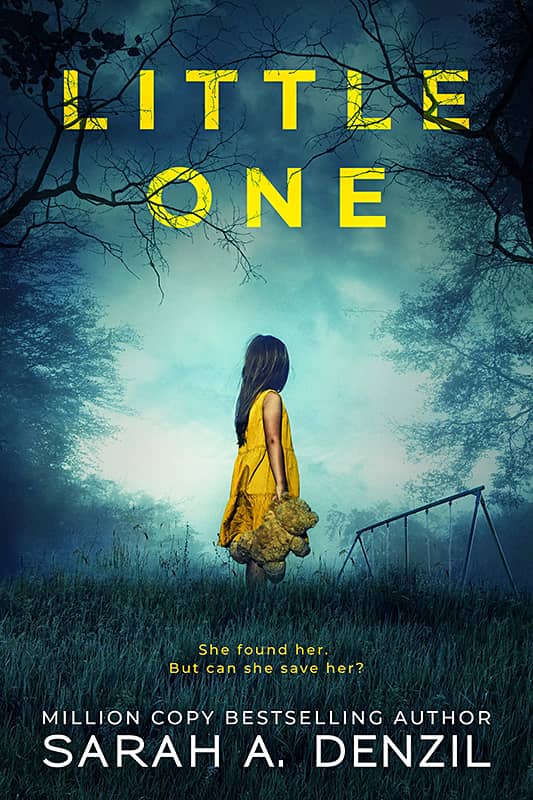
Kitten from Deranged Doctor Design


Designer: Kitten from Deranged Doctor Design
Book Title: Little One
Submitted by: Darja Deranged Doctor
Book description: A little girl, Esther, no older than seven years old, by herself in the dead of night, her pretty but old-fashioned yellow dress covered in grass stains and her hair dishevelled. She says she's waiting for Father, and that strikes Fran as particularly odd.
Alexander von Ness: Great cover design! Kitten from DDD showed us how smart she is and how great she does her job. This is again a great classic book cover design that has everything in it. Tonality, typography, composition and again yellow color that emphasizes the main role and character of the story. Congratulations once again! -Look at how many ratings the book has. I am convinced that this wonderful book cover design contributed to the sale of the book!
-

Designer: Greg Moore
Book Title: The Power of Therapy: How to Navigate Change, Transform Trauma, and Make Sense of Your Mental Health Care
Submitted by: Joshua NewmanBook description: My friend, Greg Moore created a beautiful cover for my book, The Power of Therapy. The book is self-published under Mountain Stream Books, a company I created for self-publishing my own creations.
Alexander von Ness: While this cover design is very decent, it doesn’t attract attention with anything so it gets lost in the ocean of other thumbnails (on Amazon). I think some detail should be added that would make it stand out from the rest of the covers.
-

Designer: Nissa Harlow
Book Title: Two Between Worlds
Submitted by: Nissa HarlowBook description: Cover was designed by the author.
Alexander von Ness: Nice try! Faces should definitely be bright to see facial expression. I would enlarge the faces image and fill in the hole in the upper left corner. This would give you more space for a title that would be more pronounced. I would write the title in the same font used for the author's name. Also, I would remove all the effects on the title and leave it clean in white.
-

Designer: Bree Livingston
Book Title: Broken Like Glass
Submitted by: Bree LivingstonBook description: I've struggled to find a cover for this book. The current design is lovely and fits women's fiction well, but this book doesn't fit squarely in that genre. It crosses into mystery and fantasy. Think The Shack if it were written for women.
Alexander von Ness: I find that this book cover design is much closer to your target audience than the cover design you currently have on Amazon. I think that the tonality needs to be further refined (insert a sense of mystery and fantasy). This is mostly achieved with dark blue color, the addition of fog and/or smoke, and the blurring of parts of the design. The title should be more pronounced and balanced.
-

Designer: Hannah Linder
Book Title: Finding Your Part in God's Master Story: An Exploration of Christian Worldviews
Submitted by: Janet RuthBook description: Understanding worldviews through the lens of storytelling is an overwhelming topic to capture in a picture. The simple graphic of an open book shown here on the cover invites the reader into the subject of Christian worldviews in a compelling way.
Alexander von Ness: I want to be as constructive and objective as possible and I don’t want to disappoint the author but this concept of an open book has been seen so many times. This design does not attract the attention of readers or visitors. I looked at the designer's portfolio, this is a great designer!
-

Designer: Dragana from Deranged Doctor Design
Book Title: The Curse of Cain
Submitted by: Darja Deranged DoctorBook description: Book cover design for The Curse of Cain, by Theophilus Monroe. Fantasy cover design by Dragana, Deranged Doctor Design.
Alexander von Ness: Very good design. Exactly what the target audience expects. I think the title and name of the author should be lifted up a bit. The complete picture should go a little down to make the name of the “Vilokan Asylum” series more noticeable (which is superbly made!).
Gold-starred cover design. -

Designer: Milo from Deranged Doctor Design
Book Title: Pour Some Magic on Me
Submitted by: Darja Deranged DoctorBook description: Book cover design for Pour Some Magic on Me, by Ty Burson. Fantasy cover design by Milo, Deranged Doctor Design.
Alexander von Ness: I am aware that the author required this kind of design because of the target audience but for my taste this is too colorful. Compared to other designs I’ve seen made by this designer, this designer knows very well what he’s doing, so there’s no point in commenting on this design.
-

Designer: Milo from Deranged Doctor Design
Book Title: Erupting Chaos
Submitted by: Darja Deranged DoctorBook description: Book cover design for Erupting Chaos, by Grace Hamilton. Post-Apocalyptic cover design by Milo, Deranged Doctor Design.
Alexander von Ness: A great sequel to the cover series. I really have nothing to add here except to congratulate the designer on the consistency and an excellent choice of composition. Masterful insertion of smoke and fog.
Gold-starred cover design. -

Designer: Rebecca Rebouche
Book Title: Without A World
Submitted by: Sarah FontenelleBook description: An imaginative YA science-fiction story of human progress, which may only occur alongside the brutal landscapes of ancient human instinct; a deft reminder we may never fully rid ourselves of our base nature, even as we achieve the seemingly impossible.
Alexander von Ness: Very strange design. I have to admit that I studied it a lot and thought about it (from a design point of view). The design seems very good to me, but it doesn't say anything about the book or attract attention. The title should definitely be emphasized and bolded. Interesting design, very artistic. It should be finished by someone who makes exclusively book cover design and this could be a top book cover.
-

Designer: Dilu Nicholas
Book Title: Sabbath as Resistance
Submitted by: Marcos TorresBook description: In this new edition that includes a study guide, popular author Walter Brueggemann writes that the Sabbath is not simply about keeping rules but rather about becoming a whole person and restoring a whole society.
Alexander von Ness: I like that the cover shows the rush through the motion blur effect. So the clock that tells us about the contents of the book stood out. Very interesting and clever concept. I would increase the title and maximally emphasize the word “Sabbath”.
-

Designer: Blacksheep Design Team
Book Title: The Doors of Eden
Submitted by: Thomas B. BoutellBook description: From the Arthur C. Clarke Award-winning Adrian Tchaikovsky, The Doors of Eden is an extraordinary feat of the imagination and a page-turning adventure about parallel universes and the monsters that they hide.
Alexander von Ness: I would add absolutely nothing to this design! Simply beautiful and remarkable design. If this competition had two or more winners, this design would definitely be one of the winners! One of the best book cover portfolios I have seen so far.
Gold-starred cover design. -

Designer: Rebecca Silvers
Book Title: The Serpent Sea
Submitted by: Michael BayBook description: In this followup to The Cloud Roads, Martha Wells returns with a world-spanning odyssey, a mystery that only provokes more questions — and the adventure of a lifetime.
Alexander von Ness: Another great design. Very well suited for the target audience. If typography were better, this would be another top book cover design! It is noticed that this was done by an artist.
Gold-starred cover design. -

Designer: Marry Ann Smith
Book Title: A Royal Christmas Fairy Tale
Submitted by: Kathleen BookerBook description: From the three-time Emmy Award-winning writer of Netflix sensation A Christmas Prince and Hallmark’s Christmas Camp, comes this heartwarming, feel-good Christmas romance about the power of believing in yourself to find your happily ever after...
Alexander von Ness: Since this is one of the recognizable designs of this author, there is not much to say here except that the design is very professionally made. I would not go into further commenting since the design was made to attract the attention of the target audience, which was a complete success.
-

Designer: Claudia Carlson
Book Title: Forty-Nine Guaranteed Ways To Escape Death
Submitted by: Caitlin S. SmithBook description: Author spins a tantalizing web of tales-unlikely encounters with the famous; musical instruments invented not to be easily played, but rather to be beautiful objects themselves; and mega-lists, one of which is the sublime title poem
Alexander von Ness: Beautiful design! I would change absolutely nothing! Beautifully executed typography. As I said for one previous design, if this competition had two winners, this design would be one of the winners!
Gold-starred cover design. -

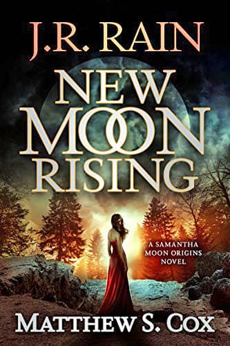
Designer: Clarissa Yeo
Book Title: New Moon Rising
Submitted by: John HyattBook description: Samantha Moon hadn't always been a vampire. Once, she had been a wife and mother, happily married to her soul mate and raising two adorable kids. That is, until she caught the eye of something evil...
Alexander von Ness: A design that fulfilled its purpose. Intrigue the target audience. I think the title could have been made much better and a different font should have been used. The moon in the background is completely invisible and needed to be brightened and emphasized much more strongly.
Gold-starred cover design. -

Designer: Levente Szabó
Book Title: The Theta Prophecy: A Time Travel Dystopian
Submitted by: Mark Lucas-TaylorBook description: The treasure at Oak Island. JFK’s assassination. A tyrannous regime’s inner-workings. Welcome to The Theta Prophecy, where alternate history meets modern dystopian.
Alexander von Ness: First of all, I have to say I looked at the designer’s portfolio. Man makes top book covers! I guess this is a unique work and not a purchased stock image. I find this cover design too dark and that’s the only drawback.
-

Designer: Caroline Teagle Johnson
Book Title: The Warbird: Three Heroes. Two Wars. One Story.
Submitted by: Guy MontagBook description: Tara Copp had seen her naive ideals about war reduced to the violent realities of modern combat. From an ambushed convoy speeding through the wrong neighborhood under heavy fire, to an airman who survived a mortar hit and his recovery at Walter Reed, Tara told their stories even as she struggled to understand her own.
Alexander von Ness: Beautiful design. Unique and special. I like it very much. I wouldn't change anything.
Gold-starred cover design.
We hope you learn something new about what works and what doesn’t work in this book cover design awards contest, and that it will help you correct any omissions and improve your book cover. Remember, a good book cover design is the best marketing tool you have to sell your book, and don’t get it wrong right from the start.
Award winners and Gold-Starred covers win the right to display our badges on their websites.
The deadline for the next submissions will be 20th December 2021.
Click here to submit your e-book cover.
Join the Self-Publishing and Book Marketing Group.
The original announcement post.
Book Cover Design Awards, October 2021
Book Cover Design Awards, September 2021
Book Cover Design Awards, Cover Design, Self-Publishing,

