Alexander von Ness - December 19, 2022
Book Cover Design Awards – December 2022
Welcome to the Book Cover Design Awards by Self-Publishing and Book Marketing Blog.
Judge: Alexander von Ness
Alexander is a book cover designer with almost thirty years of professional experience in graphic design, including over a decade as an art director in a branding agency. His website and blog are among the top trusted sites for book cover design services overall and have been selected as one of the 100 Best Websites for Writers.

The winner of this month’s
Book Cover Design Awards is
Allison Saltzman


Designer: Allison Saltzman
Book Title: The Apprentice of Buchenwald
Submitted by: Amsterdam Publishers
Book description: This universal, true story of inner strength, resourcefulness, and optimism was documented and written by grandson. It is dedicated to brave people everywhere who choose not to give up.
Alexander von Ness: Excellent cover! As soon as I saw it, I knew it would be one of the best in this competition. There is nothing to add here. Look at the designer's portfolio—an excellent designer. Once again, a fantastic design that I wouldn't change a thing about.
-

Designer: Broken Candle Book Designs
Book Title: The Secret of Giza
Submitted by: Barbara GrovesBook description: What if humanity didn't start on Earth..? If you like fast-paced thrillers with mysteries of historical significance, you’ll love The Secret of Giza!
Alexander von Ness: This cover design could be perfect if the typography weren't so clumsily made. I read many excellent reviews for this book, and regrettably, this cover design could be more eye-catching with professional typography. I really like the idea and concept. A great book that deserves a cover design worthy of its quality.
-

Designer: Tamara Dever
Book Title: Nolan
Submitted by: Tamara DeverBook description: This book is the first in The Western Promises series and introduces the protagonist, his horse, and the outlaws looking for him.
Alexander von Ness: A very good idea, but it would need some refinement. Fractals in the background are unnecessary, especially on the letters. The series' name should be slightly raised and switched to a white color. The strip should have been deleted, and the sky extended to the top because it "shortened" the size of the cover like this. I would like to see more detail on the main character. The shadows should have been reduced.
-

Designer: Milo from Deranged Doctor Design
Book Title: Erupting Trouble
Submitted by: Darja Deranged DoctorBook description: In a broken civilization the only way to survive is strength in numbers. One family is determined to work together in this new world, but will they be able to defend themselves against desperate survivors?
Alexander von Ness: What was not done well in the previous design is done well here. Everything is done excellently with composition, choice of colors, tonality, and typography. Milo is an excellent designer.
Gold-starred cover design. -

Designer: Milo from Deranged Doctor Design
Book Title: Erupting Danger
Submitted by: Darja Deranged DoctorBook description: With resources running out, family is the only bond that can be counted on. But those bonds are strained and frayed as the tensions of the new world begin to pull them apart. How can one family survive when the world has turned upside down?
Alexander von Ness: There is nothing to add here. Excellent design. Everything Milo has done so far is fantastic. Everything is done excellently with composition, choice of colors, tonality, and typography. Milo is an excellent designer.
Gold-starred cover design. -

Designer: Milo from Deranged Doctor Design
Book Title: Erupting Chaos
Submitted by: Darja Deranged DoctorBook description: The Rileys will do anything to keep their land, but after another tragedy strikes they may not be able to win. After all, what is survival worth if everything you’re surviving for is never coming back?
Alexander von Ness: There is nothing to add here. Excellent design. Everything Milo has done so far is fantastic. Everything is done excellently with composition, choice of colors, tonality, and typography. Milo is an excellent designer.
Gold-starred cover design. -

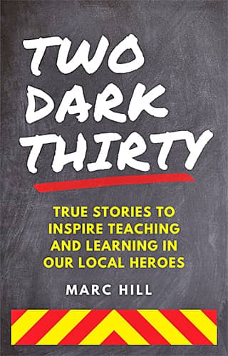
Designer: Marc Hill
Book Title: Two Dark Thirty
Submitted by: Marc HillBook description: The non-fiction educational book on how to be a successful instructor in emergency services. The title of the book deals with the time of night when all hell breaks loose and those in public service are expected to act.
Alexander von Ness: I always feel sorry when I have to give bad news to good people. This book deserves all the attention it needs because of the message it sends to its target audience. Unfortunately, I'm afraid that this cover will not achieve that. A complete redesign is required here.
-

Designer: Elizabeth Conte
Book Title: Finding Jane
Submitted by: Elizabeth ConteBook description: The main character is a museum curator, creating an exhibit. This cover reflects the theme of the book, and the time period in which the main character travels through time.
Alexander von Ness: Another self-made cover design that should be much better. Here we have a cheap picture in which letters are thrown without any sense. The text at the bottom cannot be read. Too bad, I saw that the book has excellent reviews on Amazon. With the smart cover redesign, sales of this book could skyrocket. Another excellent book that deserves a better cover.
-

Designer: Jeff Pickens
Book Title: Password for Your Mind
Submitted by: Jeff PickensBook description: Purchased license graphics used from Shutterstock.com.
Alexander von Ness: Another self-made cover design where a picture was bought and letters were just put on the image, and that's it. This cover looks like sticking a Band-Aid on a deep wound. That won't help you. It will give you the false impression that you have done something. Nice try, but this should be much better.
-

Designer: Marushka from Deranged Doctor Design
Book Title: Shane: His To Possess
Submitted by: Darja Deranged DoctorBook description: Book cover design for Shane: His To Possess, by Josephine Jade. Contemporary Romance cover design by Marushka, Deranged Doctor Design.
Alexander von Ness: A simple and idealess cover. It looks like a cheap premade cover design. I have a feeling that this cover was made in half an hour.
-

Designer: Karen Smith
Book Title: The Healing
Submitted by: Karen E StokesBook description: My book was originally published in July 2020 and my publisher recently suggested a change of cover for the Kindle version, which I subsequently designed myself.
Alexander von Ness: Another self-made cover design. This time, the author did a great job! The composition is completely correct, and with a little more experience, the author could have made a superb cover. I suggest changing the author's name to white and boost the green color of the leaves so that they stand out from the pale background. Great try, and keep going.
Gold-starred cover design. -

Designer: Tamara Dever
Book Title: Fly High
Submitted by: Tamara DeverBook description: Children going through difficult periods of loss will find encouragement through the gentle, comforting story of Fly High as the book's characters discover the mama bird they've been watching and feeding is hurt and the doctors cannot help her get better.
Alexander von Ness: Excellent illustration with inadequate typography. I looked at the book, and the illustrations are fantastic. I am blown away by them. The typography is far worse than these illustrations deserve—what a shame. The illustrations are phenomenal.
-

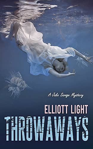
Designer: Anita Dugan-Moore
Book Title: Throwaways
Submitted by: Anita Dugan-MooreBook description: I created this cover art for Elliott D. Light. It has received many comments and I have been urged to enter it in this. Hope you like it.
Alexander von Ness: Here we have a very good concept and correct composition. I miss the color. Everything should be much brighter, and the sea should be much more blue than it is now. It will be more attractive with stronger colors.
-

Designer: Jodee Gibson
Book Title: Healing Your Map
Submitted by: Jodee GibsonBook description: The book is about healing versus treating. It’s about identifying and healing the root causes versus treating the symptoms that emanate from them. The cover was created by the author.
Alexander von Ness: Considering that the author designed her cover, she did an excellent job! She knows the psychology of cover design and what works and what doesn't. I congratulate the author on the work done, and I wish her all the best in her future work. She deserved her star.
Gold-starred cover design. -

Designer: Kevin Gen
Book Title: Coldren's Prison
Submitted by: Kevin GenBook description: I created the cover for my psychological thriller myself. The story is about a man who wakes up in a dark room, chained to the wall. The cover is to visualize this.
Alexander von Ness: Almost nothing is good about this design. The subtitle cannot be read, and the author's name is neither on the left nor in the center. The picture should be more striking. Chains and hands should be emphasized (colored), which would create the impression of depth and background. I suggest changing this design because it will do more harm than good for the book's sale.
-

Designer: Kitten from Deranged Doctor Design
Book Title: The New Neighbour
Submitted by: Darja Deranged DoctorBook description: The New Neighbour, the stunning psychological thriller from the bestselling author of The Visitors, The Only Child, The Arrangement.
Alexander von Ness: Exceptional design. Simple, creative, intelligent. That's how real masters do it! Another striking and eye-catching design from a fantastic designer. This design is everything that today's market is looking for. I am always surprised by the calmness and security with which Kitten does her cover designs. See how many ratings this book has. It can't be a coincidence.
Gold-starred cover design. -

Designer: Amra Pajalic
Book Title: The Climb
Submitted by: Amra PajalicBook description: Noah and Zephyra have been best friends since they started high school. Zephyra thinks of Noah as a brother. Noah thinks Zephyra is the one.
Alexander von Ness: I really don't know what to say about this design. I'm uncomfortable commenting on things like this. This looks like fourth-grade homework done in PowerPoint. I have no comment. After reading the reviews and seeing what the book is about, the cover is even worse.
-

Designer: Tamara Dever
Book Title: Ultimate Mix Tape: Side B
Submitted by: Tamara DeverBook description: This is a retro quiz book focused on the music of the ’70s, ’80s, and early ’90s. It's geared toward the GenX reader who lived through the golden years of the mix tape.
Alexander von Ness: Excellent design. The concept is cleverly chosen and exactly as it should be! Really good! Although I am against too much text on the front cover, this is the kind of book where it is allowed. All of us from the '80s know what I'm talking about. Very attractive and eye-catching. The gold star is fully deserved.
Gold-starred cover design. -

Designer: Micheline Ryckman
Book Title: A Lonely Dance
Submitted by: Selina R. GonzalezBook description: This is an upper YA/low-heat NA romantic fantasy fairy tale reimagining. Illustration is of the two main characters from a scene where they are dancing in an enchanted forest under a full moon.
Alexander von Ness: Another design with muted colors. The dress should be much more saturated in color, while the moon is barely noticeable in the background. The typography is very poorly made. It's a shame because this cover has a huge potential to be superb if someone who knows this job gets hold of it. I have a feeling that several unrelated people worked on this cover.
-

Designer: Dragana from Deranged Doctor Design
Book Title: River of Flames
Submitted by: Darja Deranged DoctorBook description: This is the first book in the series. It is a paranormal romance with multiple love interests, lots of mystery and secrets, and plenty of heat.
Alexander von Ness: This cover catches the eye because of the bright colors, but the effects in the title are exaggerated. The title should have been separated from the author's name. The authors' names should have been placed at the top, and the entire picture should have been lowered, so there was room for the authors' names. The main character is slightly tilted to the right, so it looks unbalanced.
-

Designer: Disa Jane Burger
Book Title: Bittersweet
Submitted by: Tayla GrossbergBook description: This is a young adult, contemporary romance book. People who enjoyed The Fault In Our Stars and The Notebook will enjoy it too!
Alexander von Ness: When I first saw this design, I thought it was a nonfiction book. It is very cold, rigid, and serious. I wouldn't want the author to be offended, but this design is a complete failure for this book. There is nothing romantic about this cover design. I would change the cover because it doesn't fit the genre it's intended for.
-

Designer: Kat Powell
Book Title: Adventures with Pop Pop at Grant’s Farm
Submitted by: Warren MartinBook description: The fourth book in the Adventures with Pop Pop series picks up with a longstanding family tradition of visits to Grant’s Farm.
Alexander von Ness: Another cover made by an illustrator (I looked at the portfolio, which has excellent illustrations), but the typography should be worked on a bit more.
-

Designer: Milo from Deranged Doctor Design
Book Title: Escaping Anarchy
Submitted by: Darja Deranged DoctorBook description: Book cover design for Escaping Anarchy, by Grace Hamilton. Post-Apocalyptic cover design by Milo, Deranged Doctor Design
Alexander von Ness: There is nothing to add here. Excellent design. Everything Milo has done so far is fantastic. Everything is done excellently with composition, choice of colors, tonality, and typography. Milo is an excellent designer.
Gold-starred cover design. -

Designer: Milo from Deranged Doctor Design
Book Title: Enduring Anarchy
Submitted by: Darja Deranged DoctorBook description: Book cover design for Enduring Anarchy, by Grace Hamilton. Post-Apocalyptic cover design by Milo, Deranged Doctor Design.
Alexander von Ness: There is nothing to add here. Excellent design. Everything Milo has done so far is fantastic. Everything is done excellently with composition, choice of colors, tonality, and typography. Milo is an excellent designer.
Gold-starred cover design. -

Designer: Milo from Deranged Doctor Design
Book Title: Surviving Anarchy
Submitted by: Darja Deranged DoctorBook description: Book cover design for Surviving Anarchy, by Grace Hamilton. Post-Apocalyptic cover design by Milo, Deranged Doctor Design.
Alexander von Ness: There is nothing to add here. Excellent design. Everything Milo has done so far is fantastic. Everything is done excellently with composition, choice of colors, tonality, and typography. Milo is an excellent designer.
Gold-starred cover design.
We hope you learn something new about what works and what doesn’t work in this book cover design awards contest and that it will help you correct any omissions and improve your book cover. Remember, a good book cover design is the best marketing tool you have to sell your book, and don’t get it wrong right from the start.
Award winners and Gold-Starred covers win the right to display our badges on their websites.
The deadline for the next submissions is 28th February 2023.
Click here to submit your e-book cover.
The original announcement post.
Book Cover Design Awards, August 2022
Book Cover Design Awards, January 2022
Book Cover Design Awards, November 2021
Book Cover Design Awards, October 2021
Book Cover Design Awards, September 2021
Book Cover Design Awards, Book Marketing, Self-Publishing, Tips for Authors,

